Quantcast
Channel: 1%
Viewing all 420 articles
Browse latest View live

How focusing obsessively on a single issue paid off for us

$
0
0
December 4, 2015

Allan Wille -

We always have our eye on our conversion rate – the number of people who convert from being prospects to paying customers.

Earlier this year, we realized we had a problem. Though we had lots of people trying our product, only about 4% of the people who entered a trial were converting into customers. And try as we might, we did not succeed in improving the conversion rate significantly between the first and the second quarters.

Why couldn’t we move the needle?

Improving the conversion rate became our war cry going into Q3.

But this time, we did things differently: We got the whole company to focus on that one issue – obsessively. How to boost the conversion rate became the topic of lunchroom conversations. Everybody started digging in - analyzing the same issue, doing research and focusing on potential solutions. It ended up being a structured look at one critical issue. The result was ideas.

And we put the best of those ideas to work. They included:

  • Putting live help into our trials. When prospective customers came looking for assistance, they got to talk to an actual person, who was able to provide them with immediate assistance.
  • Increasing the number of out-of-the-box templates for our dashboards. This allowed prospective customers to choose from a greater number of pre-built applications; with more to choose from, they were more likely to find something that suited their needs.
  • Creating virtual tours of the application. This showed prospective customers the range of what we have to offer, and allowed them to more easily visualize how we could meet their needs.
  • Improving the quality of our leads. For example, we found that a significant portion of our ad traffic was coming from a couple of Asian countries; but most of the people from those countries who clicked through our ads never converted into customers. We stopped going after people from those countries, and focused our efforts instead on parts of the world where we were already meeting with more success.

What’s awesome about this process is that it worked.

Our Q3 conversion rate shot up to 6% - a significant increase.

And we were able to tell employees that their efforts paid off – which was a powerful message in terms of company morale.

In retrospect, I think our decision to obsess about one thing was the key to our success.

We could have gone after any number of key performance indicators, but we didn’t: We focused on a single issue.

As a result, our efforts were focused, too. We had everyone in the company genuinely concerned and motivated and working towards a common goal. We were all rowing in the same direction – and that coordinated effort proved to be very powerful.

Does that mean we let other key performance indicators drop?

Yes – to some extent. But that’s not a bad thing.

Many of our other key indicators, things like retention rate or expansion, derive from the conversion rate. After all if you can’t convert people into paying customers in the first place, you can’t sell them anything else, or create incentives to keep them.

And by focusing on a single issue – the conversion rate – rather than on a number different indicators, we were also able to see what worked. If we’d chosen to focus on several different indicators at the same time, for example, we would not know for sure which moved the conversion rate.

Now we know.

We’re not saying we’re done with the conversion rate, but we’re declaring a significant victory on this issue.

Our next challenge is moving the needle on expansion and retention.


Allan Wille is a co-founder of Klipfolio, and its president and CEO. He’s also a designer, a cyclist, a father and a resolute optimist.


Dashboard Design Mistake # 3 Poor layout choices

$
0
0
December 4, 2015

Mychelle Mollot -

You have a good idea of which metrics should be on your dashboard, and now you need to decide where to put them. Upper left of the screen? Lower right? Somewhere in between?

How each metric type is laid out and visually organized has a significant impact on how easily users can get the information they need. Poor layout forces users to expend a lot of mental effort, and can ultimately lead them to abandon the dashboard in frustration.

Yet I regularly see dashboards in which the metrics appear to be laid out in the order in which the dashboard creator happened to think of them, or arranged based on how they happened to fit together geometrically, like a jigsaw puzzle.

The 3 guiding principles to good dashboard design:

There are three guiding principles to good dashboard design:

  1. The information most often checked by users goes in the upper left-hand corner;
  2. Related metrics should be grouped together; and
  3. Metrics that need to be compared should be next to each other.

Applying those principles will make any dashboard more user-friendly.

Here’s why:

1. Metrics that contain information that’s most often checked by users should be in the upper-left corner of your dashboard.

In cultures with written languages that are read from left to right and top to bottom, people intuitively look at the upper-left part of a page first.

So putting the information that users most often check in the upper left-hand corner of the screen cuts the time users spend searching for what they want.

Note that the information checked most often isn’t the same as the “most important” information.

For example, if you have a metric with the current day’s sales and another with quarterly sales results, the quarterly sales are certainly more important than any single day’s sales. The daily information will, however, be checked much more frequently (because it changes every day), and so should be positioned higher than, and to the left of, the quarterly data.

Unfortunately, I often see the prime, upper-left real estate being used for information that users will rarely or never need to check, such as a company logo….

2. Metrics that contain related data should be grouped together.

Daily and quarterly sales data figures are closely related, and in fact are just different slices of the same data set. So the second principle of dashboard design is that related information should be grouped together, with information most often checked to the left of, or above, the related data.

This way, users don’t have to “change gears” while scanning the dashboard by, for example, looking at sales data, and then at marketing data, and then at sales data again.

3. Metrics that contain data that users would find useful to compare should be placed next to one another.

It can sometimes be useful to compare unrelated bits of information. If that is the case, those Metrics should be grouped together.

For example, if you work for an online retailer, you may have created different metrics that contain sales, marketing and server/application performance metrics.

While these are not closely related types of data, it can be very useful to compare them so that users can see, for example, whether a dip in sales was caused by a decrease in online advertising referrals, or a performance problem with the server or application.

Again, it’s all about reducing the mental effort users have to make to find information that is useful for them.

I realize it is not always possible to respect these three considerations, which is why I’m offering them as “considerations,” not hard-and-fast rules for dashboard design. You’ll have to use your judgment to decide which consideration is more important in cases where you can’t respect all three.

But thinking about layout in these terms will enable you to create dashboards that users can “read” like a well-organized story, and not like a random arrangement of facts.

Next in this series: Common dashboard design mistake #4: Using chart types that don’t work well on data dashboards.


Mychelle Mollot is the CMO of Klipfolio, responsible for Marketing and Product Management. She’s also a mom, and a lover of any outdoor sport, particularly kayaking, skiing and cycling.

Dashboard Design Mistake #4: Using charts and graphs that don’t work well on dashboards. Spoiler Alert: Save the pie for dessert.

$
0
0
Dashboard Design | Charts and Graphs
December 11, 2015

Mychelle Mollot -

You know which metrics you want to show on your dashboard, and many of them are actually a series of values – for example, the total monthly expenses for the six departments in your organization for the last 12 months.

You could just show tables of numbers but generally charts and graphs work much better because:

  • They are compact: More information can be presented in a smaller area, making them particularly useful in dashboards.
  • They are easy to scan quickly. Imagine trying to make sense of numbers in a 52-cell table representing total sales for the last 52 weeks. Then imagine how much easier it is to scan, say, a bar graph that presents the same information.
  • They make it easier to see patterns. In the above example, unless you are a math savant seeing patterns in numbers versus a chart is much more difficult.

But there are two caveats:

  • Levels of precision vary. A graph will never show values as precisely as a table of numbers, so if precision is paramount then having a table with a graph, or a table on its own might be necessary. Also some types of graphs allow users to “eyeball” the individual values they contain much more precisely than other types.
  • Users have to know how to read them. Knowledge levels can vary among audiences, and it may be worthwhile testing some types of graphs with your users to make sure they are comfortable with them.

Not all graphs and charts work on dashboard

With the tables versus graph question answered your next decision is what type of chart of graph.

This is a really important question because not all graphs and chart types work well in a dashboard and some work well for some data but not other.

So it pays to understand what information you want to convey, and choose a chart or graphic that is suited to the task.

Here’s how some common graph types stack up:

Line charts

Dashboard Design | Line Chart

Compactness

Rapid scannability

Clarity

Precision

Familiarity

A great choice to display patterns of change across a continuum (usually, but not always, a continuum of time).

Bar charts

Dashboard Design | Bar Chart

Compactness

Rapid scannability

Clarity

Precision

Familiarity

A great choice to enable users to rapidly compare items in the same category (e.g. customer satisfaction in several regions).

Pie charts

Dashboard Design | Pie Chart

Compactness

Rapid scannability

Clarity

Precision

Familiarity

People are surprisingly bad at accurately comparing the sizes of the slices of a pie chart which is why top data visualization experts including Stephen Few tend to agree that they shouldn’t be used. This great article explains why. Instead of a pie they recommend a bar chart arguing it will generally do a better job of displaying the same data in about the same or less space.

Gauges

Dashboard Design | Design Gauge

Compactness

Rapid scannability

Clarity

Precision

Familiarity

Most gauges convey just two pieces of information: a current value, and where that value falls along a scale that spans some variant of “bad to good”. Just showing the value and making its text colour correspond to a point on the bad-to-good continuum (i.e., red to amber/grey to green) scale would convey the same information in about one tenth of the space.

Since real-estate is almost always at a premium on dashboards, most data visualization experts strongly recommend you don’t use them. However, if you have the space or if you have stakeholders who insist on using them, consider making vertical the normal reading for the gauge so that it is easy to scan for exceptions - particularly if you have multiple gauges.

Sparklines

Dashboard Design | Design Sparkline

Compactness

Rapid scannability

Clarity

Precision

Familiarity

While their lack of a scale means that users will not be able to eyeball individual values with any kind of precision, the incredible compactness of sparklines often makes them the only choice for showing trends when you have a large number of metrics on your dashboard. But you should definitely make sure that your audience understands how to read them.

Scatterplots

Dashboard Design | Design Scatter Plot

Compactness

Rapid scannability

Clarity

Precision

Familiarity

They are not generally useful on dashboards since they are not easy to scan quickly and the relationships between two quantitative measures (what a scatterplot shows) tend to not change very frequently. Plus, a surprisingly large number of people don’t know how to read them. However, they can be great for an interactive report for knowledgeable readers.

Maps

Dashboard Design | Design Map

Compactness

Rapid scannability

Clarity

Precision

Familiarity

When deciding whether or not to use a map on a dashboard, the main question to ask is, “Is geography an important part of the story?” If not, a bar chart would probably show the same data in less space, and with greater precision.

Here are some chart types that experts agree (most anyway) never work well on dashboards because data can always be represented in a more scannable, clear, precise and familiar way with one of the above charts:

  • Radar graphs
  • Bubble charts
  • Anything with a third axis (surface graphs, 3D line graphs, 3D bar graphs, etc.)

Again, they may work well for Infographics, reports or in-depth analysis just not dashboards.

Have a chart you love to use on dashboards? Disagree with any of the recommendations? Would love to hear from you.

Next in this series: Common dashboard design mistake #5: the misuse of colour.

How a low-tech office whiteboard stimulates creativity in a high-tech company

$
0
0
December 11, 2015

Allan Wille -

Earlier this year, when we expanded our office, we decided that one wall in the lunchroom would be the office whiteboard.

We therefore had an entire wall, 12 metres long, painted from floor to ceiling with an ultra-shiny white coating specially made to be written on with markers. It was basically an oversized version of the whiteboards you can buy in an office supply store.

We figured it would be useful, and also kind of cool, but beyond that we didn’t have any firm ideas about what we would do with our whiteboard wall. Or even whether people would use it at all.

Six months later, that whiteboard has become an office hub.

Not only does everyone use it, but it has stimulated creativity in ways we could never have imagined. And in addition, it has helped create a sense of community in the office that transcends work.

We’ve always had whiteboards in our office, but until this one they’d been in meeting rooms. So they tended to be used for specific things, on specific occasions.

Putting this one in an open area – the lunchroom – completely changed how people use it.

Because it’s inherently open, there for everybody to see, people just seem to gravitate toward it.

As a result, I don’t think there’s ever been a time since we put it up that it hasn’t been covered in writing or notes, or used for impromptu meetings.

And it has proved useful in many ways.

First, it allows everyone in the office to contribute their thoughts about specific issues or problems, making for cross-pollination of ideas.

For example, I was walking by and I saw that someone had created a list of things to focus on for a meeting I wasn’t participating in. I added an item to the list. Others have done the same.

I’ve also seen employees hold a meeting in the lunchroom so they can use the whiteboard. They’ll be in the middle of their meeting, and all of a sudden someone who was just in the lunchroom to eat lunch will pipe up with a useful idea or a comment.

Other times, employee discussions in the lunchroom have turned into impromptu meetings with the whiteboard as a tool.

The second benefit of the whiteboard has been educational.

People working on something will use the whiteboard to sketch out their ideas, and leave the results up for others to see.

I’ve found that the doodles and sketches left by my colleagues will help me have a better understanding of a concept.

The third benefit of the whiteboard has been to create a sense of community in the office.

Our social committee uses it for announcements or notes, and sometimes people draw cartoon characters on it or write office jokes. Because it’s out in the open, it’s the perfect place to reach the ‘office community.’

I think the whiteboard has been such a success because it is so accessible, and also because it is so low-tech.

Though we are a software company with all sorts of tools at our disposal, the low-tech whiteboard with markers and sticky notes is a very easy medium for brainstorming. There are basically no constraints. It’s effortless.

It’s good to remember that fancy technology isn’t the best solution to every problem; sometimes, low-tech works better.


Allan Wille is a co-founder of Klipfolio, and its president and CEO. He’s also a designer, a cyclist, a father and a resolute optimist.

New Klips for TrendSpottr, HubSpot, Zoho and Google Analytics

$
0
0
New in the Gallery - TrendSpottr, HubSpot, Zoho and Google Analytics
December 14, 2015

Stephen Yates

Did you know that there are 16 ounces in a pound?

Luckily, we have more than just a pound of new Klips in the Gallery this week...we have a TON! (see what I did there?)

Here are the latest additions to our Gallery:

TrendSpottr

TrendSpottr Dashboard | TrendSpottr Klips

TrendSpottr is an awesome service that predicts emerging trends, viral content and key influencers for any topic in real-time. Today, our friends over at TrendSpottr are giving Klipfolio users 4 bonus Klips! This means users do not need a TrendSpottr account to add them. These feeds are about what's trending and is about to go viral for various topics.

  • Star Wars (Bonus!) - See what Star Wars topics are getting people excited.
    Add Klip to Dashboard
  • Content Marketing (Bonus!) - Always know what's trending in Content Marketing by monitoring the latest discussions.
    Add Klip to Dashboard
  • Social Media (Bonus!) - See which Social Media topics are inspiring discussion.
    Add Klip to Dashboard
  • Wearable Tech (Bonus!) - How is Wearable Tech influencing business? Track what's driving this conversation now.
    Add Klip to Dashboard
  • Your Custom Feed - Curious about what's trending in a certain topic? Create your own custom feed with TrendSpottr.
    Add Klip to Dashboard

HubSpot

HubSpot Dashboard | HubSpot Klips

HubSpot is a digital marketing platform for social media marketing, email marketing, content management, web analytics, search engine optimization, and more.

  • Academy RSS Feed - Get the most recent how-to posts, customer stories and product updates from HubSpot.
    Add Klip to Dashboard

Zoho

Zoho Dashboard | Zoho Klips

Zoho CRM gives you a 360-degree view of your complete sales cycle and pipeline. Identify trends and increase efficiency by visualizing your Zoho CRM metrics on a dashboard.

  • Number of Open Potentials by Stage (Last 200 Potentials) - Compare and monitor your different types of accounts.
    Add Klip to Dashboard
  • Lead Sources (Last 200 Leads) - Discover which marketing channels attract the majority of your leads.
    Add Klip to Dashboard

Google Analytics

Google Analytics Dashboard | Google Analytics Klips

The GA Klips that you know and love have just gotten better. Rather than being a fixed timeframe, users can now select the time range dynamically within each Klip.

  • Audience Metrics - See how your Users, Sessions, and Pageviews trend over time.
    Add Klip to Dashboard
  • Audience Metrics vs Targets - Track the number of users that visited your website, the number of sessions, and the total number of pageviews in the time period of your choice.
    Add Klip to Dashboard
  • Traffic Channels - Displays the top online channels generating traffic to your website during the time period of your choice.
    Add Klip to Dashboard
  • Social Media Conversions - Compare conversion rates from various Social Media platforms during the time period of your choice.
    Add Klip to Dashboard
  • Total Social Media Conversions - See a summary of total social media lead conversions during the time period of your choice.
    Add Klip to Dashboard
  • Website Performance - Track your website's Avg. Bounce Rate, Avg. Page views, New Sessions, and Avg. Time on Site for the time period of your choice.
    Add Klip to Dashboard
  • Sessions by Region - Track where your website sessions are coming from during the time period of your choice.
    Add Klip to Dashboard
  • Sessions by Device Type - See what devices your website traffic is using for the time period of your choice.
    Add Klip to Dashboard

Klipfolio gets cozy with Plotly

$
0
0
Klipfolio gets cozy with Plotly
December 17, 2015

Ali Pourshahid -

Plotly is a comprehensive visualization library with tons of flexibility and rich features. You can create a number of different visualization types including basic, statistical and financial visualizations. Plotly also provides a great deal of flexibility with respect to layout options of the visualizations. Furthermore, the library not only supports a good level of interactivity on the visualizations (for example,. pan and zoom) but also allows you to define more interactive controls that interact with components of the visualization like dropdowns and slider filters. Last but not least, the Plotly library is open source and available to use for free.

At Klipfolio we always look for opportunities to extend and complement our app by integrating with other libraries and services. In a previous blog post I explain in detail how you can use the Klipfolio’s “HTML template” to build a customized visualization using the Vega visualization library. If you have not read that post or are not familiar with the basics of using the HTML template, I recommend you have a quick read through the post or at least our tutorial on the HTML Template. In this post I assume you are familiar with some of the basic concepts of our HTML template.

Your first Plotly visualization in Klipfolio

To create your first Plotly visualization in Klipfolio, start by setting up a new HTML template Klip. For this first example, we use hard-coded data so don’t worry about selecting or creating data sources when building the Klip.

Next, add the JavaScript code (see below) required to load Plotly.js and render the visualization. All you need to do is copy and paste the following code into the Script section of the HTML Template. To expose the Script section, first click on the HTML Template component in the tree and then click on “Use JavaScript with this HTML Template” in the properties pane at the bottom.


//Define the path configurations to the JS module that you want to load

var vizmodules = {
    plotly               : 'https://cdn.plot.ly/plotly-latest.min.js?noext'
};

// Get the Klipfolio data model from the component context
var _dataModel = this.dataModel;

//Pass in the configurations to requirejs
requirejs.config({
    paths: vizmodules
});

//Load the libraries
require([vizmodules.plotly],
    function(PlotlyEngine) {

      // Define the data array expected by Plotly
      // Using hard coded data (as the first step)
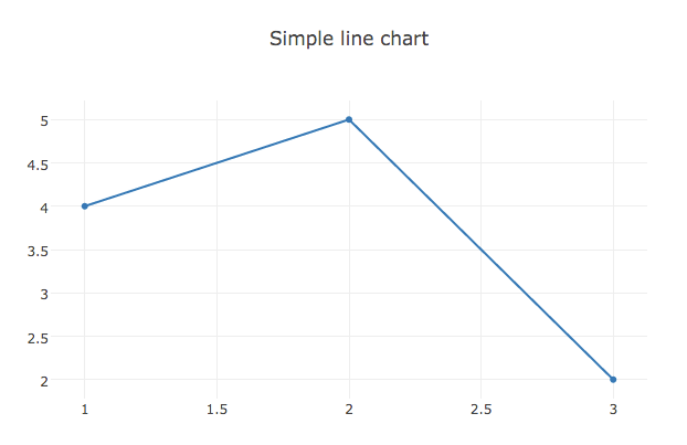
      var data = [{
            x: [1, 2, 3],
            y: [4, 5, 2]
        }];

       //Define the layout object and layout object
        var layout = {
            title: 'Simple line chart'
        };

      // Pass call the plot method with the appropriate parameters:

      // 1: The HTML element that the chart will be plotted in
      // 2: Data that will be rendered
      // 3: The layout specification
      PlotlyEngine.plot('plotly-div-simple', data, layout);
});

Finally, to be able to render the visualization you also need to add the following HTML code to the HTML section of your HTML Template Klip. The JavaScript code references the HTML element that is defined in this HTML code. The id attribute of the HTML element has to have the same value as the first parameter passed to the plot function in the last line of the above JavaScript code (see text in red).

<div id="plotly-div-simple"></>

Tip: If you are building several custom visualizations, make sure they each have a unique id in the HTML element. In other words, do not reuse the same id.

After updating the HTML template, you should see the following visualization rendered in the Klip editor:

Plotly in Klipfolio | Simple Chart

Using Klipfolio data

Now that you are familiar with the HTML template and you can render a visualization using Plotly in the Klip editor, it’s time to plot some real data! In this scenario, you will use the data that’s provided by the Klipfolio data layer and pass it to Plotly to render. For this, we are going to use the following sample data:

https://static.klipfolio.com/images/saas/Training-Sample-Data.csv

Create a data source using the sample data and add it to your Klip. Then define two data series using the following names and formulas:

NameFormula
citySLICE(B:B)
scoreSLICE(C:C)

After defining the above series, your component tree should look like the following:

Plotly in Klipfolio | Klip Editor

Finally, replace the hard-coded data definition in the JavaScript code that you used above:


//Define the layout object and layout object
 var data = [{
      x: [1, 2, 3],
      y: [4, 5, 2]
 }];

Use the following code that employs Klipfolio’s HTML Template Data Model and transforms the data into the format that is expected by Plotly.


   // helper variables

    var _x = [];
    var _y = [];

  // Push the Klipfolio data model data points into the helper variables
    _.each(_dataModel.data, function(element){
      _x.push(element.city);
      _y.push(element.score);
    });

  // Define the data array in the format expected by Plotly
  // Use the helper variables that were populated with Klipfolio data above

      var data = [{
            x: _x,
            y: _y,
            type: 'bar' //Choose to use a bar visualization
        }];

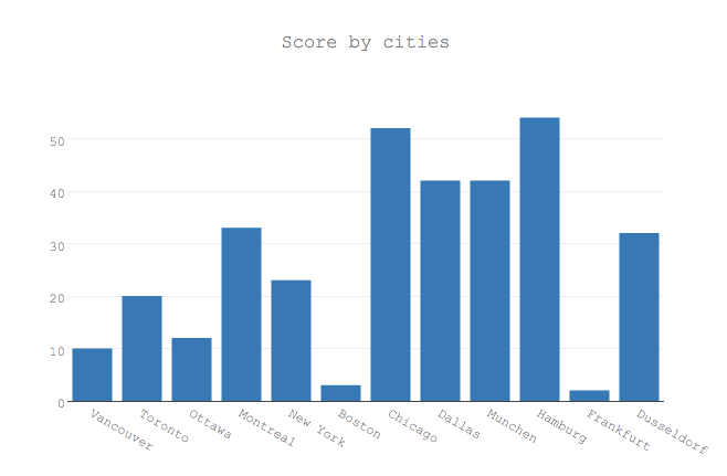
The result is the following bar visualization:

Plotly in Klipfolio | Bar Chart Visualization

Update the layout options

In the next step you will update the visualization layout options. As you may have noticed, the title of the above visualization is no longer accurate since it’s not a line chart. Plotly allows you to change the title, font and more properties using the layout options (Read more here).

For the next step, replace the layout definition in the above JavaScript:


 //Define the layout object and layout object
 var layout = {
     title: 'Simple line chart'
 };

Use the following code snippet that defines the new title and font options.

The result after the visualization is rendered looks like this:

Plotly in Klipfolio | Bar Chart Visualization Rendered

Toolbar configuration options

Plotly visualizations render with an interactive toolbar by default. While there are some really cool features included such as Save as Image, Compare and Pan, a dashboard designer may not want to include it on a dashboard that is mostly meant to be used for monitoring purposes. The good news is Plotly has a set of configuration options that allow you to hide or customize the toolbar by passing the config options when calling the plot method.

To completely hide the Plotly toolbar, use: displayModeBar:false and pass it as an object and the fourth parameter in the plot call (see red text below).

PlotlyEngine.plot('plotly-div', data, layout, {displayModeBar: false});

If you want to customize the toolbar but keep some of the functionality, you can list the buttons that you want to exclude. For instance, to hide both the Plotly logo and “send to Plotly Cloud” button, use the following config properties:

{modeBarButtonsToRemove: ['sendDataToCloud'], displaylogo: false}

Summing up + Bonus visualizations

In this post, we covered how you can very quickly use Plotly in Klipfolio to build custom visualizations. While Klipfolio supports many visualizations natively, being able to use other libraries and extend the visualization capabilities is one of the strengths of our flexible platform that we are proud of and we’d like our customers to be aware of and use. We covered a few examples in this post but there are many more to explore and have fun with for you visualization geeks out there.

Thanks for reading this far. As a bonus, here are a few visualizations (Plotly supports a long list of visualizations.) that may be useful for your dashboards if you follow the above instructions and transform and feed them the Klipfolio data model as they expect.

Waterfall

The Waterfall visualization is used to plot the cumulative impact of positive and negative values and their total (Read more here).

Plotly in Klipfolio | Waterfall Visualization

Reference: https://plot.ly/javascript/bar-charts/

Box plot

Shows a groups of numerical data via their quartiles (Read more here).

Plotly in Klipfolio | Box Plot Visualization

Reference: https://plot.ly/javascript/box-plots/

Histograms

A Histogram is a visualization used to show the distribution of numerical data (Read more here).

Plotly in Klipfolio | Histogram Visualization

Reference: https://plot.ly/javascript/histograms/

Appendix: For your convenience, the complete JavaScript code used in the example above.


var vizmodules = {
    plotly               : 'https://cdn.plot.ly/plotly-latest.min.js?noext'
};

requirejs.config({
    paths: vizmodules
});

var _dataModel = this.dataModel;

require([vizmodules.plotly],
    function(PlotlyEngine) {

    var _x = [];
    var _y = [];

    _.each(_dataModel.data, function(element){
      _x.push(element.city);
      _y.push(element.score);
    });

        var data = [{
            x: _x,
            y: _y,
            type: 'bar'
        }];

        var layout = {
            title: 'Score by cities',
            font: {
             family: 'Courier New, monospace',
             size: 12,
             color: '#7f7f7f'
           }
        };

      PlotlyEngine.plot('plotly-div-simple', data, layout, {modeBarButtonsToRemove: ['sendDataToCloud'], displaylogo: false}
);
});

Why giving employees time off is a good thing – and how we manage it over the holiday season

$
0
0
December 18, 2015

Allan Wille -

It has always been a tradition at Klipfolio to give our employees the whole week off between Christmas and New Year’s.

Our recent growth has meant we’ve had to adapt to a new reality. We no longer shut down completely like we used to. But we have managed to make that adjustment without sacrificing one of the core elements of our work culture, which is recognizing balance and the value in time off.

Before we put our services up in the cloud, it was easy to shut down over the Holidays. We’d close up shop on Dec. 24 and reopen on Jan. 2, and everyone would get the time off. These were bonus days, above and beyond regular vacation days.

But we’re too big to shut down completely now. We’re a cloud company with over 4,000 customers, some of whom – hospitals, for example – don’t ever close. I don’t think there’s a single second that ever goes by without someone, somewhere, being on our servers.

Two years ago, we decided we needed to keep the office open over the Holidays.

But we also decided we would not run full-tilt. Instead, we developed a formula for a skeleton staff that involved people rotating through for one day over the holiday; we also created an escalation call list so that if there was an unusual problem, extra people could be called in as needed.

The system works well.

Our customers are less active at this time of year, and there are generally fewer people contacting us for support. We do also tell customers we’re scaling down our operations for the Holidays. I think it makes our relations with our customers more human.

Those staff members on the holiday rotation, take their time off in the new year.

That’s important to us.

There are some companies where a frantic work pace is part of the culture. People boast about being double-booked for meetings, and answering an email in the middle of the night is a badge of honour.

Our approach is, I think, a little more balanced. We’ve always had a culture where, when we’re in the office, we work hard. But when it’s time to go home at the end of the day, or take time off for Christmas or for holidays, we take the time off.

I think the time off makes for better employees.

Does answering an email at midnight make someone more effective? I don’t think so. Working harder doesn’t mean you are working smarter. If you’re running around all the time, you are probably in reactive mode. You don’t have time to reflect.

We want to have employees who are thinking about things properly and who are very motivated, but who are not in pure reactive mode.

So we want people to take their vacation without feeling guilty for doing it.

The time off allows everyone the chance to change gears and think about different things. When you do that, your mind is operating at a different cadence – and that gives your mind some time to rejuvenate. Think about how you feel halfway into a vacation, when you’ve finally had time to unwind.

The benefits of time off go beyond staff morale and make for better mental health too.

The year is coming to a close. We think it’s good to make it feel like it’s coming to a close, and spend some days at home.

So we’re celebrating a good year and encouraging everyone to take some time to relax.


Allan Wille is a co-founder of Klipfolio, and its president and CEO. He’s also a designer, a cyclist, a father and a resolute optimist.

Dashboard Design Mistake #5: Misuse of Colour

$
0
0
December 18, 2015

Mychelle Mollot -

Dashboards contain a lot of information and it is very easy to create a display that is visually overwhelming.

This is particularly true when it comes to colour.

Properly used, colour is an important tool for conveying meaning.

But badly used, colour can be confusing and even misleading.

Here are the five common mistakes when it comes to using colour in dashboards:

1. Over-using highly saturated colours
2. Using different colours to represent the same item on different charts
3. Assigning random colours to items in a sequence
4. Misusing traffic light colours
5. Using the company’s corporate colours

Here’s how to deal with each of those mistakes:

1. Over-using highly saturated colours

Saturated

Desaturated

Highly saturated colours are colours that are at or near 100% in intensity, whereas de-saturated colours are closer to grey:

In nature, full-saturation colours often indicate threats or mating opportunities (think plumage, flower petals, blood, etc.), and we’re evolutionarily wired to immediately pay attention to them.

If a dashboard is full of highly saturated colours, everything is demanding attention, so users don’t know what to look at first. They end up feeling overwhelmed.

It’s best to tone most colours down.

Klipfolio’s default colour palettes are already nicely desaturated, but you can also use Cynthia Brewer’s excellent site, http://colorbrewer2.org/, which does a great job of suggesting colour palettes that are comfortable to look at. As a bonus, this site even suggests palettes that handle colour-blindness.

There is a role for fully saturated colours, but it’s limited to calling out things that require the user’s attention.

2. Using different colours for the same item on different charts

In a dashboard, consistency is important. It reduces the mental effort users have to make to understand what they are seeing.

So be consistent in your use of colour: If you use a brown line to show, say, the Western region in one line chart on your dashboard, try to use brown to denote the Western region in all the charts on your dashboard.

3. Assigning random colours to items that have an inherent sequence

Colour is an important tool for grouping items. Here again, consistency is important.

For categories that have an inherent sequence or relationship (time, risk levels, grade levels, lead progression etc.), you can make it easier for users by using the same hue (blue, for example) for all items, but varying the intensity of the hue (see example below). Users then only have to remember that higher-intensity colours are more recent/advanced/progressed/riskier or whatever, which is easier than memorizing multiple random colours.

Example of random colours for related items in a sequential activity (funnel conversions)

Same example with the same colour but varying hues

Cynthia Brewer’s http://colorbrewer2.org/ is a great resource for this. Just select the “sequential” radio button to get good sequential palettes for use in your dashboards.

4. Misusing “traffic light” colours

In Western societies, red means “stop” or “bad” and green means “good” or “go.” This can be extremely useful when designing dashboards:

However, there are a few things to avoid, and consider when using them:

1- Inconsistency: If green and red are used to denote “good” and “bad” in one chart, they shouldn’t be used to denote anything else in any other chart on your dashboard. For example, if red means “bad” on one chart and “East region” on another, this suggests that the East region is bad. If used consistently and strategically, however, traffic light colours can enable users to quickly scan the whole dashboard and spot problems (red objects) and opportunities (green objects) with ease.

2- Misusing amber/yellow: If a value is neither good nor bad, it’s usually of less interest to users. Colouring it with amber is, therefore going to draw a lot of unwarranted attention, and makes the dashboard a lot busier.

3- Overuse: Not everything needs to be red/green colour-encoded. Only major problems and opportunities in the data should be red or green, so that they pop out. If there’s too much red or green, you can end up with the Christmas tree effect, in which the dashboard is an undecipherable mess of red and green objects.

5. Using your corporate colours

You may be tempted (or asked) to assign your organization’s corporate colours to elements in your dashboard charts.

This is almost always a bad idea…….

First, your organization’s colours may be too intense, too light, or otherwise unsuitable for dashboards.

Second, if they are colours that people associate with concepts, such as red (bad, hot), green (good) or blue (cold), using them in your dashboard may be misleading, or at least very limiting from a design perspective.

And since most dashboards are used inside the organization, it’s also unnecessary to use corporate colours – unless you’re worried people are going to forget what organization they’re working for!

Avoiding the above mistakes will make your dashboards easier to use. They’ll also be more attractive. And research suggests that people find information more credible when it’s presented in an attractive manner.

Next in this series: Common dashboard design mistake #6: Forcing users to do mental math.


2015 in Review

$
0
0
December 23, 2015

Allan Wille -

As 2015 comes to an end and I reflect back on the year, I’m very proud of the product, services, education and support our small, tight-knit team was able to deliver to our customers and partners this year.

To celebrate our accomplishments we’ve put together a year in review. Check it out: Klipfolio: 2015 in Review.

Best wishes to all for a happy, healthy and prosperous new year!

Providing a Meaningful Financial Dashboard Outside of Excel

$
0
0
Klipfolio Blog | Providing a Meaningful Financial Dashboard Outside of Excel
January 13, 2016

Stacey Shrout -

Sharing key financial metrics with stakeholders is an important part of my role as a Controller. Sharing information is not the challenge but sharing information in a way that is meaningful can be a challenge. Because I spend most of my days using excel spreadsheets I constantly make the mistake that everyone I deal with enjoys these spreadsheets as much as I do.

With the recent growth at Klipfolio, departmental budget reporting has become a growing requirement. So every month I started providing the department managers with excel budget vs actual reports on their departments’ monthly performance. This was my version of an excel dashboard. Months after I began providing this information I started to get feedback from the management team that they thought they didn’t have the data or that they didn’t like to look at the data in the excel format that it had been provided in. Once again, I had made the assumption that excel is for everyone.

To resolve this disconnect, naturally we turned to our own product for assistance. We decided that I would provide the monthly budget reports in a financial dashboard and that I would distribute this information via a private link that only the key stakeholders had access to.

The process was so simple that I questioned myself why I hadn’t made this change months ago. Following these simple steps, I have been able to provide the management team with meaningful financial dashboards:

1. Identify the key financial metrics that you want to report on

For this exercise we focused on budget vs actual results for the month, the quarter and the year to date. But you don’t have to stop here. Do you research and find the key metrics that relate to your business.
If you are unsure of what these metrics are talk to your team. They will tell you what they need to do their job.

Financial Dashboard | Financial Key Metrics

2. Locate where data is stored and add these data sources to your Klipfolio account

My favourite thing about Klipfolio is that you can pull various data sources into one Klip. This means that your budget may reside in excel and your actual financial results may reside in Xero or Quickbooks. Not a problem. Set up various data sources in Klipfolio so that your Klip has access to all of this information and can seamlessly update your Klips when you are not at work.

Financial Dashboard | Financial Data Sources

3. Build your Klips

Klipfolio provides many options to visualize your data. For my budget vs actual reports I created simple bar charts. Each Klip took me only minutes to build once I had chosen my visualization type and had my data sources in Klipfolio.
All Klips are customizable and editing Klips is becoming easier every day with all of the efforts from the fantastic team at Klipfolio.

Financial Dashboard | Build Financial Klips

4. Distribute your Klips via a private link

Once your Klips are ready to share activate the private links option on your account and email your link out to those you want to share with.

Financial Dashboard | Private Links

Excel is a very powerful tool that we rely very heavily on in all facets of business. But we need not be bound to our excel dashboards. We now have other options. By using excel with other platforms such as Klipfolio we can help our key stakeholders make good business decisions at the right time without forcing them to dive into excel spreadsheets.

Give it a try today and see what kind of impact it has on your organization.

My New Year’s resolutions are external. Here’s why.

$
0
0
Startup Founder Blog | My New Year’s resolutions are external. Here’s why.
January 8, 2016

Allan Wille -

When you first start a company, you can’t help but spend time with customers. It’s part of the process of figuring out where you will generate business.

Besides, in the beginning you are a tiny operation and there is no one else to do it. Everyone, including the CEO, is front and centre talking to potential clients. It’s nerve wracking, it’s exciting, it’s not scalable, but it’s entirely necessary.

But things change as your company grows.

Over time, I became focused on our product and on marketing. I obsessed over the efficiency of the funnel that transforms leads from prospects to happy customers.

In the process, I ended up spending more and more time in the office – and less and less time speaking with people on the outside.

It happened gradually. We were growing, and I was getting wrapped up in the operational details. There were emails and meetings and discussions that focused on important issues – usually immediate concerns, like how were we going to handle the next 90 days. This is not to say I was not thinking about customers. I was, but en masse, not as individual stories.

At Klipfolio, our users are central to everything we do. Our customer success team and our product and user experience researchers are in constant contact with them.

But, for me, there is a kind of customer contact that is different from the daily back and forth that goes on.

Whenever I did talk to a customer directly – and it happened rarely – I would come away amazed by how refreshing and valuable the experience was.

Recent meetings with two customers in Boston made me remember just how valuable. In fact, I have come to the conclusion that I must make talking to customers a regular part of my job. That’s why I resolve to talk to at least one customer a day in 2016.

There’s much to gain. The Boston customers gave me information I could never have gotten anywhere else – important information that will help direct the future of our business.

  • They walked me through the process of how they chose Klipfolio.
  • They told me how they evaluated our product.
  • They clued me in on how important the skill sets of their internal staff are.
  • They explained to me how they got internal approval to buy our product.
  • And they let me know what other companies they had looked at, telling me a lot about our competitors in the process.

Getting that kind of information from a bona fide customer is absolutely incredible - a real eye-opener. It took me out of my day-to-day world into a whole other experience. I need many more similar experiences.

Speaking with customers is not the only way to gather new insights.

I recently attended a conference where two future-themed presentations focused on disruption and opportunity – big trends coming our way that we need to be aware of.

Attending that conference was far removed from a typical tactical day for me. It was full of ideas and information that had very little to do with the next 90 days, and it gave me an outlet to let my mind wander off in new directions and think about the future.

It was very motivating. As we grow, I’ve come to realize that what I bring to the company needs to change. I need to spend more time thinking about the big picture.

This is not natural for me. I’ve always struggled with strategy and with trying to figure out what’s going to be important in the future; I’m much more of a tactical person – the kind of guy who gets things done in the here and now.

But strategic thinking is necessary. If I’m going to help guide the company into the future, I have to take time to figure out which direction to go in. I have to look at what options are available to us and make the right choices.

Listening to customers is one way to do that. Another is to get out of the office and look for new ideas by attending conferences that may not be directly related to our business.

In 2016, I resolve to do both of these important actions.


Allan Wille is a co-founder of Klipfolio, and its president and CEO. He’s also a designer, a cyclist, a father and a resolute optimist.

Why hiring an in-house lawyer was the right thing to do

$
0
0
January 15, 2016

Allan Wille -

When we started Klipfolio, we used lawyers only when we absolutely had to.

They’re expensive, right? Why pay a lawyer if you can cobble something together yourself? Sure, we worked with a law firm to draft our really important documents, like our incorporation documents. And we used outside counsel for things like trademarks and our financings.

But customer agreements? Employee agreements? Our website’s privacy statement? In the early days, I wrote them all myself, cutting and pasting from different documents until I had something I thought was OK. And I know every other small business does the same thing.

But flying by the seat of our pants doesn’t cut it anymore now that we’ve grown. We started working more often with our legal firm - in part because I did not have the time to continue writing and updating our agreements, and in part because I knew I was not the right person to do this for many reasons. That’s why last year, on the recommendation of our chief financial officer, we brought on a general counsel - an in-house resource who spends a day every week working with us.

It’s another rite of passage as we grow.

I see any agreement having elements of both opportunity and risk. Opportunity had better be grounded upon mutual benefit. Risk arises from the probability and severity of exposure from issues not covered, contemplated or jointly understood. What’s the likelihood that you may get sued, for example? And if you do, how much of a problem would it create?

The higher the probability of any action, and the greater the severity of that action, the greater the need for legal protection.

But the truth is, you don’t really think too much about all that when you’re starting out - and nor should you. You’ve got too many other things on your mind.

I don’t think there’s anything fundamentally wrong with the legal agreements we have – the ones I pulled together – but the fact is, they’re not as simple or as elegant as they could be. They’re also not consistent and some essential elements may be missing.

So, as a first task, the role of our general counsel is to take stock of all of our agreements, and to get a sense of our exposure. This is a big part of making sure our legal affairs are in order.

For the last few months, she has been coming in one day a week to review our existing paperwork, fix what needs to be fixed, and make sure our legal documents are clear, consistent and enforceable.

She is reviewing all of our legal agreements, both internal and external, to see whether anything falls short. She is looking at our security and privacy exposure. And she is setting priorities so we know what to tackle first.

As our general counsel, she is also here to advise us on what we need to do as we grow.

For example, when a company reaches a particular number of employees, certain legal obligations kick in. Your company must be compliant with a range of complex and frankly burdensome government regulations and you (you personally if you are a director or an officer) and the company can be fined if the company is not. In this area, she will work mostly with finance and HR to make sure we are not offside, and to alert us about what needs to be done.

There’s another big reason to have our legal affairs in order.

When you go through a round of financing – as we did last year – you have to disclose all your legal obligations. This includes all the contracts you’ve signed, your employee agreements, and what open-source software you use and how that’s managed. Everything.

It’s a big job to pull all the pieces of the legal puzzle together.

If we ever do go for another round of financing, having all of our legal paperwork in good shape and ready to present to investors will save months of work and a lot of money.

It will also send a message to investors that we take our legal obligations seriously, and that increases their confidence in making an informed decision.

In the meantime, our lawyer’s work is creating efficiencies inside the company - at a rate that is less than our outside counsel. We are able to take a proactive approach. And far exceeding what I was ever able to do, our legal documents are now consistent, clean, fair and binding.

And that means we’re better protected as a company. It is worth the cost of having in-house legal counsel as we continue to evolve.


Allan Wille is a co-founder of Klipfolio, and its president and CEO. He’s also a designer, a cyclist, a father and a resolute optimist.

New Klips for HubSpot

$
0
0
New in the Gallery - HubSpot
January 18, 2016

Stephen Yates

Did you know that The Magnificent Seven was inspired by the film Seven Samurai? Well the 7 magnificent Klips that we released last week should inspire you to create an amazing HubSpot dashboard. These new Klips are an addition to the 6 HubSpot Klips already in the Gallery.

HubSpot

HubSpot dashboard example

HubSpot is a digital marketing platform for social media marketing, email marketing, content management, web analytics, search engine optimization, and more.

  • Blog Subscribers (This Month) - ompare how many people looked at your blog this month and last month, and use the handy indicator to quickly see if the percentage of views is up or down.
    Add Klip to Dashboard
  • Blog Views (This Month) - Track the number of subscribers for this month and compare it against the last month subscribers count.
    Add Klip to Dashboard
  • List Growth (30 Days) - Select one of your HubSpot lists and see how it has grown over the past 30 days.
    Add Klip to Dashboard
  • Landing Page Stats (This Month) - A quick and easy report on the status of a landing page, featuring a list of key landing page metrics for this month.
    Add Klip to Dashboard
  • Blogs - Use this at-a-glance chart to track when your latest blog posts came out, and what their topic was.
    Add Klip to Dashboard
  • Landing Page Submissions by Sources (This Month) - Make sure the form on your chosen landing page is generating leads. See where your leads are coming from this month and compare submission success rates for each source.
    Add Klip to Dashboard
  • Landing Page Submissions Over Time (This Month) - Track submissions on your chosen landing page this month.
    Add Klip to Dashboard

New Klips for Zoho, Infusionsoft and Weather

$
0
0
New in the Gallery - Zoho, Infusionsoft and Weather
November 6, 2015

Stephen Yates

The new Klip Gallery allows you to track your key metrics with just a few clicks. We’ve created pre-built Klip templates for some of the most popular services and data sources. You can get the Klips that matter most to your business right from our Gallery to your dashboard in minutes.

Here are the latest additions to our Gallery:

Zoho

Zoho dashboard example

Zoho CRM gives you a 360-degree view of your complete sales cycle and pipeline. Identify trends and increase efficiency by visualizing your Zoho CRM metrics on a dashboard.

  • Number of Accounts by Type (Last 200 Accounts) - Compare and monitor your different types of accounts.
    Add Klip to Dashboard
  • Number of Potentials by Probability (Last 30 Days) - Ensure success by comparing potential clients to their probability of closing.
    Add Klip to Dashboard
  • Open Potentials (Last 30 Days) - Outperform this month by monitoring the overall metrics of your Zoho CRM potentials.
    Add Klip to Dashboard
  • Value of Open Potentials by Stage (Last 200 Potentials) - Compare and monitor your different types of accounts.
    Add Klip to Dashboard

Infusionsoft

Infusionsoft dashboard example

Infusionsoft is a complete sales and marketing automation software for small businesses combining CRM, email marketing, lead capture and e-commerce.

  • Payment by Type (Last 1000 Payments) - Monitor your top payment methods by type.
    Add Klip to Dashboard
  • Top 10 Contact Sources (Last 1000 Contacts) - See where your traffic is coming from by visualizing your top ten contact sources.
    Add Klip to Dashboard
  • Top 10 Invoice Items (Last 1000 Items) - Discover which invoice items are bringing in the most revenue.
    Add Klip to Dashboard

Weather

Weather dashboard example

There are endless options for visualizing your location's weather. To get started, pick any or all of these impressive weather Klips.

  • Hourly Weather (Temperature) - Use this hourly weather forecast to monitor your conditions today.
    Add Klip to Dashboard
  • Hourly Weather (Wind) - Discover the hourly wind conditions for your chosen location.
    Add Klip to Dashboard
  • Today's Weather (Detailed) - Get all the details about today's weather forecast.
    Add Klip to Dashboard
  • Today's Weather (Simple) - Use this simple report for today's weather.
    Add Klip to Dashboard
  • Weekly Weather Forecast - Monitor this week's weather forecast and always know what to wear.
    Add Klip to Dashboard

Where do you want to be X years from now?

$
0
0
Startup Founder - Where do you want to be X years from now?
January 22, 2016

Allan Wille -

As any company founder will tell you, for the first 12 months survival is always top of mind. That means developing a product people need and repeatedly selling it to a sufficiently large and accessible market. If you can do that, you might be able to meet payroll. Usually, the planning horizon is the next few weeks or months rather than the next few years.

But as a company matures, it becomes necessary to extend the planning horizon.

It is particularly important to have a plan when you prepare a budget, since you want to be able to say: “This is how I think things will unfold, and as a result, these are our revenue forecasts and the resources I need.”

There are many ways to develop a strategic plan. Every company is different, and so are the processes. What’s important to one firm may be irrelevant to another.

But every strategic plan has the same starting point: Where do you want to be X years from now?

In many strategic plans, these aspirations are usually found in vision, mission, goals or objectives statements.

The actual terminology is not important as long as you set a clear direction.

Start by doing an environmental scan. This really means looking at everything that might affect your business over the next few years – including how your customers behave.

This can be time-consuming and frustrating because there are so many things to consider.

You could look at broad subject areas like how political and economic conditions could change, or you could look at legal and regulatory developments in your industry, emerging technologies, demographics, or even social and ethical trends.

For us, the big ‘Aha! moment’ was truly understanding our customers.

But if everything is important, then nothing is important. So who decides?

The knowledge, experience and insights of the founders are important. You built the original business, so you know what’s had a major impact. Together with your team you should sort out what information and opinions are relevant to help focus the environmental scan.

You should also canvass your customers, suppliers and financial supporters.

That is exactly what happened at Klipfolio in the development of our initial strategic plan.

We focused on four areas that have a big impact on our future business.

First, I wanted us to look at the outlook for our target customers. In other words, what does the future hold for small and mid-sized businesses? After all, our future success is closely tied to theirs.

Several weeks ago, I wrote about the importance of reaching out to customers on a regular basis. Their projections, expectations, hopes and fears are important information to be considered in the strategic planning exercise. How can we make our customers more successful?

The second area I wanted us to look at was market influences. What big technologies or processes would shape our market? Are there hiring trends or demographic shifts that we need to be aware of? Where would potential new business come from? And for all of these questions, why? For example, we know that for our small and medium-sized business customers, adoption of cloud services and the use of mobile devices has been a huge, unmistakable trend.

The third area I selected for consideration was the current competitive landscape. What your competitors will or may do is extremely important.

We know who our main competitors are. We keep abreast of their new products and services, their marketing, their pricing and their other competitive tactics. This is where strategic planning becomes a giant chess game, as you try to figure out their next moves and how to position against, counteract, or perhaps complement them. And, opportunistically, you should have a similar strategy map for all of your complimentary business partners.

The fourth area for our strategic plan was establishing key drivers or levers for success. You must identify those components of your business that set you apart from the crowd - and which, more importantly, are valued by your target customers. It could be a technological advantage, industry-leading service standards, or the unique knowledge of your team.

These drivers or levers for success will guide the operational plans you will need to develop to implement your strategic plan.

The strategic plan offers a long-term view – it presents where you want to be in, say, three years. It is supported by a one-year tactical plan that supports growth targets. That tactical plan (which includes the roadmap, marketing programs, the hiring and financing plan, and business development activities) involves the hard choices that have to be made to bring these goals to fruition. Each element in your budget supports these tactics.

No strategic plan should be static. It should be a rolling plan, because nothing stands still.

For example, we update our roadmap every month and our budget forecasts quarterly; the strategic plan should be updated at least once a year.

Developing our strategic plan has been an important learning experience, but one made easier by starting with understanding our customers. I welcome your ideas and tips from your own strategic planning initiatives.


Allan Wille is a co-founder of Klipfolio, and its president and CEO. He’s also a designer, a cyclist, a father and a resolute optimist.


How the surging U.S. dollar is changing the tech landscape in Canada – and what to do about it

$
0
0
January 29, 2016

Allan Wille -

The continuing fall of the Canadian dollar in relation to the U.S. currency has been drawing a lot of attention lately.

It should. The growing differential between the Canadian and U.S. currencies is sure to have a significant impact on the Canadian economy as a whole, and on the tech sector in particular.

So should the Canadian tech sector be concerned?

Yes, though it’s not all bad news. But good or bad, the decline in value of the Canadian dollar in relation to the American dollar has the potential to be a game-changer. Everyone in the tech sector needs to be attuned to its effects. Here are three things to watch for:

1. Canadian tech firms are now more vulnerable to talent poaching or takeover

I was chatting with our human resources person earlier this week, and he told me he’d just received a call from a U.S. tech firm looking to attract Canadian talent.

That set off alarm bells in my head. The call was a little close for comfort - it told me we were vulnerable to talent poaching from U.S. firms.

We have awesome employees – some of the best in the business. But how will they react if a U.S. firm comes along and offers them a salary in U.S. dollars? Will they pack up and move south?

I think we will see more aggressive tactics from U.S. recruiters looking to attract Canadian talent.

To keep their people, Canadian companies need to make sure they are really good employers. In addition to paying competitive wages, they have to create a culture that makes their firm attractive and they have to make sure to keep their employees challenged so they feel valued and grow with the business.

Sometimes that may not be enough.

There are a lot of U.S. companies looking to grow, and a big way to grow is to acquire other companies. Buying a company in Canada may be seen as a low-risk way of bringing top talent into a firm and lowering expenses all at the same time.

A low Canadian dollar makes Canadian firms particularly vulnerable to acquisition. We have to be aware of that fact.

2. Canadian firms may have an advantage

The growing differential between the Canadian and U.S. currencies is not all bad news.

The decline of the Canadian dollar actually benefits some companies. For example, if you sell your product in U.S. dollars, as some firms do, while most of your expenses are in Canadian dollars, the dollar’s decline is a windfall.

From a funding point of view, American investors will see their dollars go further in Canada. It may be easier to get venture capital in the U.S. because Canada is relatively ‘cheap’ for Americans. Furthermore, any efficiency metric that is helped by the currency differential will make Canadian companies look better.

So Canadian firms not active in the U.S. should take the time to get to know that market.

3. Canadian firms need to show caution in the face of a fluctuating currency

No firm should confuse a good tail wind with success. The decline of the Canadian dollar does not mean a company is any better; it simply means it’s getting an unexpected boost. And doing crazy things with that windfall is not a good idea.

What goes up can just as easily come down. So in the face of instability, a wise firm puts money aside to deal with an uncertain future.

What kind of uncertainty?

Well, firms don’t know yet what the new exchange rates will do to their customer base. Will they lose customers in Canada? Will the cost of retaining and attracting employees outweigh the currency benefits?

And how will the new exchange rates affect a future round of financing? Globally, as soon as there is any kind of market uncertainty, venture capitalists focus inwards on their current portfolio. This means that they will be far more selective with new opportunities. Canadian venture capitalists have less buying power, but they remain under pressure to place their funds. It’s a double-edged sword. They too would be wise to be cautious.

Tech firms in Canada need to be, as well.

So maybe this is the time to focus on stability, and cash, rather than growth at all costs.

In the coming months, I think there’s going to be increased interest in Canada on the part of U.S. firms. Canadian firms need to be ready to face this new reality. They can do it by being good employers, taking advantage of opportunities in the U.S., and putting some money aside to guard against the negative effects of currency fluctuations.

Klipfolio is actually in a good position right now. But we – and all Canadian firms – need to keep our eyes wide open as we look ahead.


Allan Wille is a co-founder of Klipfolio, and its president and CEO. He’s also a designer, a cyclist, a father and a resolute optimist.

Dashboard Design Mistake #6: Forcing users to do the math

$
0
0
February 1, 2016

Mychelle Mollot -

The main raison-d’être of a dashboard is to enable decision-makers to consume information quickly. The design mistakes we’ve discussed in this series all have one thing in common: They all sloooow the user down.

In this final post in the series, we’ll look at a common dashboard design mistake that can drastically increase the amount of time users spend trying to make sense of the information on even a fairly simple dashboard. Let’s call it “forcing the users to do the math.” It is characterized by presenting information in a way that forces users to do calculations themselves to get at what they need.

What if you were a Sales Manager and you were presented with the following chart:

Dashboard Software - Monthly Sales vs. Target Sales

Seems clear enough at first glance, right?

But you would quickly realize that it isn’t easy to get the answers you want the most from this chart:

  • Which months were below target?
  • Which months were above target?
  • And by how much?

You can answer these questions, but you’ll have to compare the distance between the “sales” line and the “sales target” line, month by month, in order to see the overall picture and spot exceptionally good or bad months.

Now as a dashboard designer the question you need to ask yourself when you build dashboards like this is… “Why am I irritating my users off by making them work to get the answers they need”. Instead you should be giving them this:

Dashboard Software - Monthly Sales vs. Target Sales

Much better I’m sure you’ll agree but not quite there. The Sales manager would most likely want to see the actual sales values for each month and the trends. Something like this:

Dashboard Software - Monthly Sales vs. Target Sales

This new chart offers the best of both worlds:

Rapid insights into how sales compared to targets across all months (bars)

And

Actual sales values and overall trends (line).

Tips for understanding when you are making your users do mental math

How do you know your users are not getting what they want? Watch them as they review the information on their dashboard. These clues are signs your dashboard should be doing more math for your users:

  • They look up at the ceiling in concentration or point at the screen as if to not lose their spot.
  • They constantly look back and forth between two charts. Could you combine the measures in both charts into a calculated value?
  • They scribble numbers on a pad, or use Excel, or a calculator.

Providing a fully usable dashboard requires some thought on the part of the designer. It’s one more reason why it’s crucial to develop a solid understanding of your users’ jobs, concerns, goals, etc.

Become a Dashboard Designing Hero

If you want to be a dashboard design hero to your users then build the ultimate calculated value: a composite score.

Imagine you are building a sales dashboard that shows a list of customers with metrics like:

  • Days since last purchase
  • Number of purchases in past 12 months
  • Days since last contact
  • After talking with the sales team, you discover that they frequently use that information to try to identify customers who are at greatest risk of defection to a competitor.

    Mentally combining these three numbers to get the overall sense of the likelihood of defection for hundreds of customers requires the sales team to do some pretty nasty mental gymnastics.

    Define and calculate a “Defection risk score” that combines all three for them and you’d not only save them time but you’d ensure the math was done right each time.

    The math behind composite scores can get a little hairy. But if you’re able to create a calculation that even remotely approximates the mental process that users were going through beforehand, you’ll definitely be a data hero. This resource will help if you want to give it a try https://en.wikiversity.org/wiki/Composite_scores

    There’s lots more to learn about dashboard design. But if you’ve been following since the first post in this series, you’ve seen that even a little knowledge goes a long way toward delighting users.

    To really go to school on Dashboard design I strongly recommend:

    Information Dashboard Design by Stephen Few
    http://www.amazon.ca/Information-Dashboard-Design-Effective-Communication/dp/0596100167

New Klips for QuickBooks Online

$
0
0
New in the Gallery - QuickBooks Online
February 4, 2016

Stephen Yates

You know what they say, there are just three types of accountants: those who can count and those who can't. Whether you are an accountant, CEO, or small business owner, you are going to love using these 11 new QuickBooks Online Klips to track performance and get the insights that you need to grow your business.

QuickBooks Online

QuickBooks dashboard example

QuickBooks Online is designed to manage payroll, inventory, sales and other needs of a small business.

  • Sales by Product - Make sure your products are profitable by monitoring each of their sales metrics during the time period of your choice.
    Add Klip to Dashboard
  • AP and AR Balance - See your Accounts Payable and Accounts Receivable at-a-glance during the time period of your choice.
    Add Klip to Dashboard
  • Customer Balance Summary - Cash-flow can make or break a venture. See which customers are current and which ones owe you money during the time period of your choice.
    Add Klip to Dashboard
  • Revenue - Ensure the financial health of your business is in tip-top shape with this simple, real-time report on revenue for the time period of your choice.
    Add Klip to Dashboard
  • Expenses - You have to spend money to make money! Monitor your expenses for the time period of your choice and compare it to the previous period.
    Add Klip to Dashboard
  • Income and Expenses - Bring your key accounting puzzle pieces - Income, Expenses, and Profit - together to help you make actionable decisions. Choose the time period of your choice from the drop-down menu, and compare to the previous period.
    Add Klip to Dashboard
  • Top 10 Customers by Income - Gain a steady flow of profitable clients by monitoring your top 10 income-earning customers during the time period of your choice.
    Add Klip to Dashboard
  • Vendor Expenses - Monitor your vendor expenses on an ongoing basis. Delve into individual vendor expenses and see the total for the time period of your choice.
    Add Klip to Dashboard
  • Income and Expenses (Last Month) - Let your business thrive by maintaining the fine balance between income and expenses over the past month.
    Add Klip to Dashboard
  • Income and Expenses (Last 12 Months) - Discover trends by monitoring your business income, expenses and profit over the past 12 months.
    Add Klip to Dashboard
  • Income and Expenses (Last Year) - Get the big picture on your income and expenses over the last fiscal year and let it help you plan ahead.
    Add Klip to Dashboard

Why is a business dashboard company building a Super Bowl dashboard?

$
0
0
February 5, 2016

Chris Wolski -

A lot of us at the office like football. We know a lot of people outside our office also like football, and will be watching the “big game”. So we decided to mobilize our software to build the ULTIMATE real-time “Big Game Dashboard”, complete with pre-game, in-game and post game stats, fan and media commentary, fun facts, betting lines, and social sentiment surrounding the half-time show and commercial ads.

Klipfolio Dashboard | Big Game Dashboard

Check the dashboard out

While this dashboard wasn’t incredibly difficult to build with a number of amazing software integrations at our disposal (namely Talkwalker, Moz and Trendspottr), it wasn’t something we could build on a whim, and “we like football” wasn’t a pitch that was going to get the project greenlit by our CMO.

So why did this project get the green light? Phrased another way, why would a business dashboard company build a “Big Game” dashboard?

Here’s the short answer:

1. We’re re in the business of bringing data to life;
2. It can be challenging to convey the value of real-time business dashboards to those with little or no experience using them;
3. Bringing data surrounding the “big game” to life is a way to showcase the power and potential of business dashboards in a more accessible, more relatable way.

We see the value that business dashboards can create for a wide variety of people and businesses everyday. We see dashboards enhancing the performance of marketers, sales and support reps, tech professionals, data and financial analysts, supply chain managers and Execs. We see them used by agencies and consultancies, NGOs and health organizations, growing startups and mature enterprises. And we see them driving business growth.

But despite the many benefits and growing adoption rate, business dashboards are not as common as they should be, and their value is not intuitive to everyone.

Enter our “Big Game Dashboard”. It’s our effort to make the power and possibilities of dashboards more accessible, and more relatable, to more people.

Our hope is that non-business dashboards like this (we also published public dashboards surrounding the MLB trade deadline, the GOP debates and the Canadian election in 2015) get professionals thinking about the power and potential of Klipfolio dashboards, to help them excel in their business roles, and to drive the growth of their companies.

Why startups should think twice about business incubators

$
0
0
February 5, 2016

Allan Wille -

Business incubators are part of today’s landscape for startups.

Once relatively rare, incubators are multiplying rapidly and even openly competing for business.

But are incubators a good idea for everyone? I think there are many good reasons why fledgling companies should be wary of them.

First-time entrepreneurs need to remember that they have other choices – options that give equal or better value, without the pitfalls I believe incubators create.

Simply put, a business incubator is an organization that helps startups get going by providing things such as office space, Internet access and services that can include advice, mentoring, training, marketing and help with financing.

I have several issues with incubators.

The first has to do with the services they provide.

It’s great to get cheap office space, phone and Internet - an attractive offer when you’re starting up and can’t afford any of this. We did it.

But a startup needs more than that. Most importantly, first-time entrepreneurs need all manner of advice – about things like hiring and pricing and the many other issues they have not yet learned to face.

But in reality, too many incubators offer either real estate without sufficient advice - or advice that is too narrowly focused.

The second issue I have with incubators has to do with focus.

I have started two companies, one in a cramped room as a student and one in my basement.

In both cases, we obsessed about the gap we saw in the market, we poured our energy into our nascent product, and we started getting the word out. We were building stuff!

We made tons of mistakes along the way, but we also learned.

Growth didn’t come quickly. But it did come, because we focused on our product and our market. That’s what mattered.

There may come a time when a company will want to look for investors. But remember, investment is not a measure of success.

And here is the problem. A lot of incubators seem to push startups down the financing path too early in the game.

Instead of the founders focusing on their product and the market, visions of riches and hockey-stick growth cloud their minds. Time is spent thinking about valuation, cap tables, and term sheets.

As far as I am concerned, that is all a waste of time!

The founders of a startup should not spend a single second thinking about share structures and financing until they have evidence of value.

My third issue follows from the second, and it’s about control.

Is an incubator a public service – or is it a business?

If the incubator is a business, then its own interests won’t necessarily mesh with those of the startup it wants to help.

Many incubators will take a share of equity in a startup. And there you go! Right or wrong, you’re on the path to raising money.

Be very wary of giving up equity early on. Do you really want to be stuck with this new shareholder? Take a moment and really understand what the investor’s motivations are.

Most early-stage companies don’t need funding. They need advice.

The fact is, there are many other ways for startups to get the advice and guidance they need.

For example, young entrepreneurs will find lots of advice at boot camps or conferences. They can visit entrepreneurship centres. There is also a small trickle of “no-equity incubators” that I find refreshing.

They can network on LinkedIn and tap into the vast resources of the Internet.

And they can look for mentors among existing successful firms. Most entrepreneurs are happy to make introductions and otherwise help a start-up. And they will usually do it for free.

In fact, there are lots of places where you can educate yourself – places where they aren’t going to take any equity.

That is the model I believe in.


Allan Wille is a co-founder of Klipfolio, and its president and CEO. He’s also a designer, a cyclist, a father and a resolute optimist.

Viewing all 420 articles
Browse latest View live